


Create a Responsive Website with HTML, CSS, and JS
how to create a responsive website with HTML, CSS, and JavaScript. Follow this step-by-step guide from Neody IT to build a website that adapts to any screen size and delivers a seamless user experience.

How to Create a Responsive Website with HTML, CSS, and JS
Introduction
In today’s digital age, having a responsive website is crucial for ensuring a seamless user experience across all devices. Whether you’re a business owner, blogger, or developer, creating a responsive website allows you to reach a wider audience. In this comprehensive guide, Neody IT (www.neodyit.in) will walk you through the process of building a responsive website using HTML, CSS, and JavaScript. We will cover the basics, essential techniques, and advanced methods to make your site fully adaptable to different screen sizes.
What is a Responsive Website?
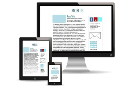
A responsive website is a site designed to provide an optimal viewing and interaction experience across various devices, from desktops to smartphones. Instead of creating multiple versions of a website for different devices, responsive design uses flexible grids, media queries, and adaptive elements to ensure proper display and usability.
For example, a well-optimized website developed with the guidance of Neody IT (www.neodyit.in) will automatically adjust its layout, text size, and images based on the device being used, ensuring smooth navigation.
How a Responsive Website Works
A responsive website is built using three core technologies:
- HTML (HyperText Markup Language) – Defines the structure of the website.
- CSS (Cascading Style Sheets) – Controls the layout, design, and responsiveness.
- JavaScript – Adds interactivity and dynamic behavior.
Step 1: Structuring the HTML
Start with a simple HTML structure. This serves as the foundation of your website.
Create a file index.html and paste these codes in it.
<pre>
<!DOCTYPE html>
<html lang="en">
<head>
<meta charset="UTF-8">
<meta name="viewport" content="width=device-width, initial-scale=1.0">
<title>Responsive Website</title>
<link rel="stylesheet" href="styles.css">
</head>
<body>
<header>
<h1>Welcome to Neody IT</h1>
</header>
<nav>
<ul>
<li><a href="#">Home</a></li>
<li><a href="#">About</a></li>
<li><a href="#">Services</a></li>
<li><a href="#">Contact</a></li>
</ul>
</nav>
<section class="content">
<p>Learn how to create a responsive website with HTML, CSS, and JS.</p>
</section>
<footer>
<p>© 2025 Neody IT</p>
</footer>
</body>
</html>
</pre>
Step 2: Styling with CSS
Use CSS to make your website responsive. Media queries help adapt the design for different screen sizes.
Create a file styles.css and paste these codes in it.
body {
    font-family: Arial, sans-serif;
    margin: 0;
    padding: 0;
}
nav ul {
    display: flex;
    list-style: none;
    justify-content: space-around;
    background-color: #333;
    padding: 10px;
}
nav ul li a {
    color: white;
    text-decoration: none;
}
@media (max-width: 600px) {
    nav ul {
        flex-direction: column;
        text-align: center;
    }
}
Step 3: Adding JavaScript for Interactivity
Enhance the website with JavaScript to add interactive elements.
Now Create a file script.js and paste these codes in it.
document.addEventListener("DOMContentLoaded", function() {
    alert("Welcome to Neody IT's Responsive Web Design Tutorial!");
});
Now link javascript in html - paste these codes in your html code - .
Key Benefits of a Responsive Website
- Improved User Experience – Visitors enjoy a seamless experience across all devices.
- Higher Search Engine Rankings – Google prioritizes mobile-friendly websites.
- Cost Efficiency – A single responsive website is cheaper than maintaining multiple versions.
- Increased Conversions – A smooth user interface encourages engagement and sales.
- Future-Proof Design – Adapts to new devices and screen sizes without major modifications.
Challenges and Limitations
- Complexity in Development – Requires careful planning and testing.
- Performance Issues – Large images and scripts may slow down load times.
- Browser Compatibility – Some older browsers may not support modern CSS or JavaScript features.
Real-World Examples of Responsive Websites
- Neody IT (www.neodyit.in) – A prime example of a fully responsive website optimized for all screen sizes.
- Amazon – The world’s largest e-commerce site offers a seamless experience across devices.
- BBC News – News website optimized for readability on desktops, tablets, and mobile devices.
Expert Opinions and Future Trends
Web development experts predict that:
- AI-driven design tools will automate responsive design.
- Progressive Web Apps (PWAs) will enhance mobile responsiveness.
- CSS Grid and Flexbox will dominate web layout structures.
FAQs
Q1: Can I create a responsive website without coding?
Yes, website builders like WordPress and Wix offer responsive templates.
Q2: What tools can I use for testing responsiveness?
Use Chrome DevTools, Responsinator, or BrowserStack.
Q3: Is JavaScript necessary for a responsive website?
Not always, but it helps enhance user interactivity.
Q4: How long does it take to build a responsive website?
It depends on complexity, but a basic site can be built in a few hours.
Q5: How does Neody IT help in responsive web development?
Neody IT (www.neodyit.in) provides expert guides, tutorials, and development services to help you create the best responsive websites.
Conclusion
Creating a responsive website with HTML, CSS, and JavaScript is essential in today’s mobile-driven world. By following the techniques outlined in this guide from Neody IT (www.neodyit.in), you can build a website that adapts to any screen size and provides an excellent user experience. Start building your responsive site today and ensure your online presence remains strong and accessible!
What's Your Reaction?
 Like
1
Like
1
 Dislike
0
Dislike
0
 Love
0
Love
0
 Funny
0
Funny
0
 Angry
0
Angry
0
 Sad
0
Sad
0
 Wow
0
Wow
0