


Pivot Tables in Excel for Data Analysis
Learn how to use Pivot Tables in Excel to summarize large datasets, analyze sales by region, and generate business insights. A beginner friendly Pivot Table guide by Neody IT for aspiring data analysts.
Pivot Tables in Excel for Data Analysis: Beginner Guide
Introduction: Why Pivot Tables Are Powerful for Data Analysis
In the modern data driven world, organizations generate massive amounts of data every day. Sales transactions, customer interactions, marketing campaigns, and operational processes all produce valuable datasets. However, having large amounts of data alone does not create value. The real value comes from analyzing that data and extracting insights that help businesses make better decisions.
For beginners entering the field of data analytics, Excel remains one of the most widely used tools for analyzing structured data. Among all Excel features, Pivot Tables stand out as one of the most powerful tools for summarizing and analyzing large datasets quickly.
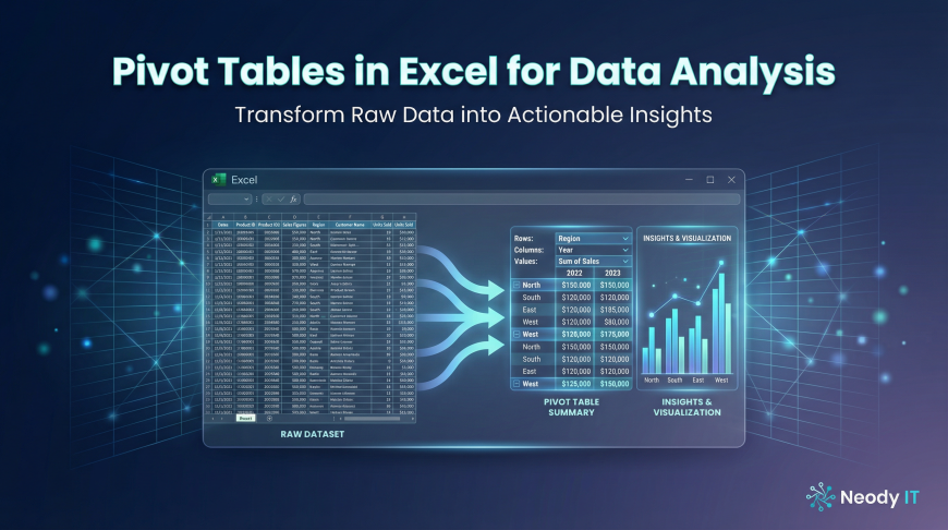
Imagine a company with thousands of sales transactions recorded in a spreadsheet. Manually analyzing this data to understand regional performance or product demand would take hours of work. With Pivot Tables, analysts can summarize this information instantly.
For example, instead of manually calculating totals for each region, a Pivot Table can instantly show total sales by region, product, or time period.
At Neody IT, we emphasize that learning Pivot Tables is an essential skill for beginners in data analytics. Pivot Tables simplify complex datasets and allow analysts to quickly discover patterns, trends, and insights.
Understanding how to use Pivot Tables effectively can significantly improve the speed and quality of data analysis.
What is a Pivot Table?
Simple Definition
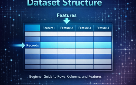
A Pivot Table is an Excel feature that allows users to summarize, analyze, and reorganize large datasets quickly.
Instead of manually writing formulas across hundreds of rows, Pivot Tables automatically group and aggregate data based on selected categories.
This means that raw spreadsheet data can instantly be transformed into meaningful summaries.
For example, consider a dataset containing thousands of sales transactions with information such as product name, region, revenue, and date. A Pivot Table can summarize this dataset into useful reports such as:
Sales by region
Sales by product category
Monthly revenue trends
This ability to transform raw data into structured summaries makes Pivot Tables one of the most valuable tools in Excel.
Why Pivot Tables Are Important for Data Analysts
Data analysts frequently work with large datasets that contain thousands or even millions of records. Manually analyzing such data would be extremely time consuming.
Pivot Tables simplify this process by allowing analysts to quickly aggregate and reorganize data.
Key benefits include:
Quickly summarizing large datasets
Identifying trends and patterns
Creating reports for business decision making
Reducing manual calculations
Because of these advantages, Pivot Tables are widely used in many industries including business analytics, financial reporting, marketing analysis, and sales reporting.
For beginners learning data analysis, mastering Pivot Tables is an important step toward developing practical analytical skills.
Understanding Pivot Table Components
To use Pivot Tables effectively, it is important to understand their main components. These components allow users to organize and summarize data in different ways.
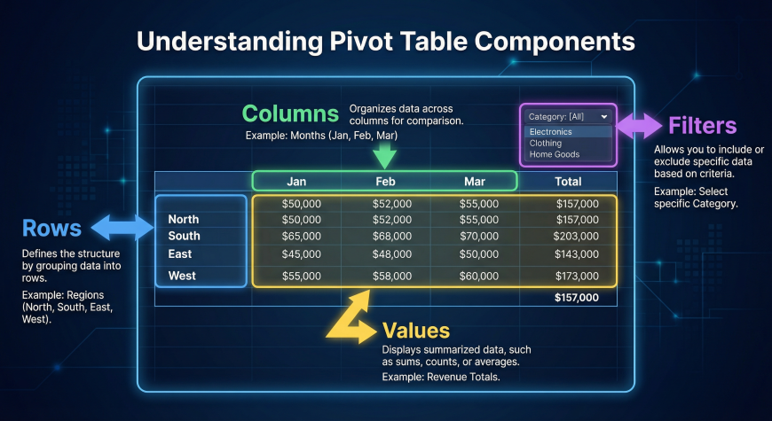
Rows
Rows represent the categories used to group data vertically.
For example, in a sales dataset, rows might contain categories such as region, product category, or salesperson.
If region is placed in the Rows section of a Pivot Table, Excel will automatically group all sales data based on different regions.
The output might display results such as total sales for North, South, East, and West regions.
Columns
Columns organize summarized data horizontally.
Columns are useful when comparing performance across time periods or categories.
For example, if the Date field is placed in the Columns section, the Pivot Table might show monthly sales performance.
This allows analysts to quickly compare how revenue changes from one month to another.
Values
The Values section contains the aggregated results of the dataset.
These are the numerical calculations performed by the Pivot Table.
Common value calculations include:
Total sales using SUM
Average revenue using AVERAGE
Number of transactions using COUNT
Excel automatically applies these aggregation functions depending on the type of data being analyzed.
Filters
Filters allow analysts to focus on specific parts of a dataset.
For example, an analyst might want to view sales data only for a specific region or product category.
By applying filters in a Pivot Table, users can quickly display only the relevant portion of the data.
Filters make it easier to explore insights within large datasets without modifying the original data.
Example Dataset for Pivot Tables
To understand Pivot Tables better, consider a simple sales dataset containing the following columns:
Product
Region
Salesperson
Quantity
Revenue
Date
Each row in this dataset represents a single sales transaction.
Using this dataset, analysts can perform various analyses such as:
Revenue by region
Sales by product category
Monthly sales performance
Pivot Tables allow these analyses to be generated instantly without writing complex formulas.
Step by Step Guide to Creating a Pivot Table
Creating a Pivot Table in Excel is straightforward and requires only a few steps.
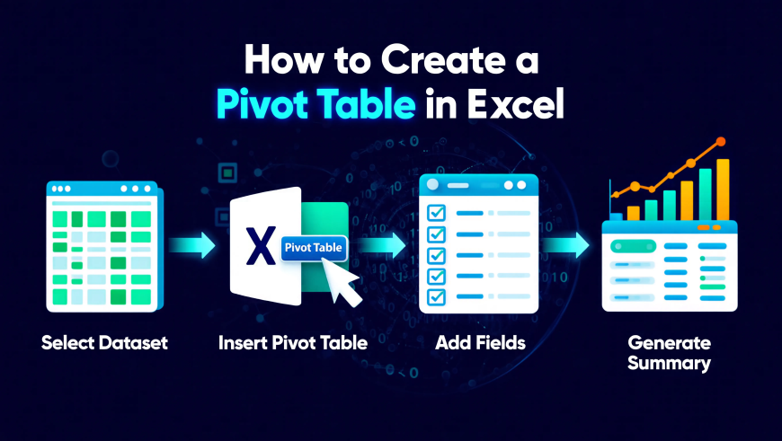
Step 1: Select the Dataset
First, select the entire dataset including column headers.
For example, highlight all rows and columns containing fields such as Product, Region, Revenue, and Date.
Selecting the full dataset ensures that Excel includes all relevant data in the Pivot Table.
Step 2: Insert a Pivot Table
Next, go to the Insert tab in Excel.
Click on the Pivot Table option.
Excel will automatically detect the selected dataset and prompt you to choose where the Pivot Table should be placed.
You can place it either in a new worksheet or within the existing sheet.
After confirming, Excel will generate a blank Pivot Table layout.
Step 3: Add Fields to the Pivot Table
Once the Pivot Table layout appears, Excel displays a field list containing all dataset columns.
You can create summaries by dragging these fields into different sections.
For example:
Drag Region into the Rows section
Drag Revenue into the Values section
Excel will instantly calculate total revenue for each region.
This automatic aggregation is one of the main reasons Pivot Tables are so powerful.
Step 4: Customize the Pivot Table
Pivot Tables are highly flexible and can be customized easily.
Users can sort results, apply filters, and change calculation types.
For example, adding the Date field to the Columns section allows analysts to view monthly sales trends.
This ability to reorganize data dynamically helps analysts explore different insights quickly.
Real World Business Example: Sales by Region
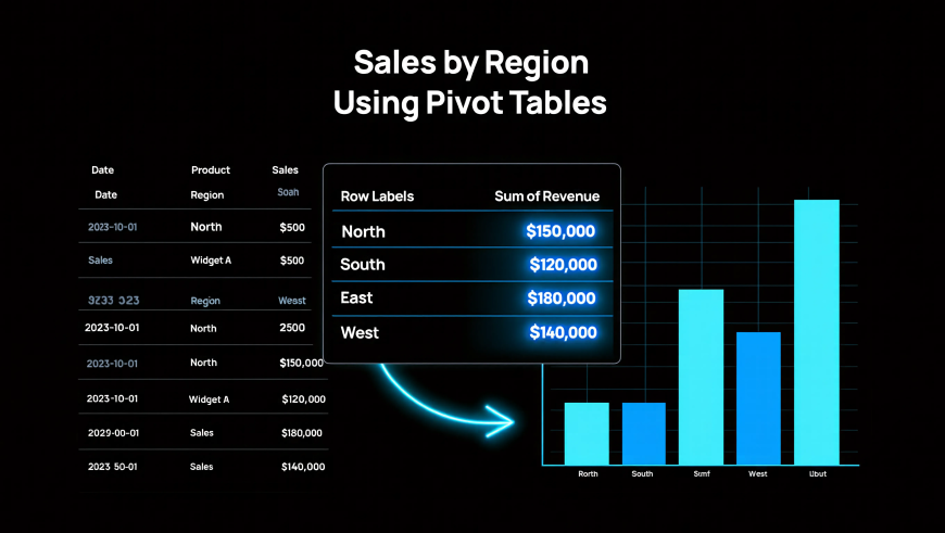
Consider a company that operates in multiple geographic regions.
Management wants to understand which regions generate the most revenue.
Using a dataset containing columns such as Region, Product, and Revenue, analysts can create a Pivot Table with:
Region placed in the Rows section
Revenue placed in the Values section
The Pivot Table will automatically calculate total revenue for each region.
The output might show results such as:
North region revenue
South region revenue
East region revenue
West region revenue
With this information, business leaders can identify high performing regions and adjust strategies accordingly.
Common Pivot Table Use Cases in Business Analytics
Sales Performance Analysis
Businesses frequently use Pivot Tables to analyze sales data.
Examples include:
Revenue by product
Revenue by region
Monthly sales trends
These summaries help companies monitor performance and identify growth opportunities.
Customer Analysis
Pivot Tables are also useful for understanding customer behavior.
Analysts may use them to study:
Customer purchase patterns
Customer segments
Purchase frequency
These insights help businesses improve customer targeting and retention strategies.
Marketing Campaign Analysis
Marketing teams rely on Pivot Tables to evaluate campaign performance.
For example, they may analyze:
Conversion rates
Leads generated by marketing channel
Campaign performance across regions
Pivot Tables make it easy to compare marketing results and optimize strategies.
Pivot Tables vs Manual Calculations
Before Pivot Tables, analysts often relied on manual calculations using multiple formulas.
This approach required creating formulas across many rows and columns, increasing the risk of errors.
Pivot Tables simplify this process by automatically summarizing data.
Instead of writing multiple formulas, analysts can generate summaries instantly.
Pivot Tables also update automatically when the dataset changes, making them far more efficient than manual calculations.
Common Mistakes Beginners Make with Pivot Tables
Although Pivot Tables are easy to use, beginners sometimes encounter issues.
Common mistakes include:
Datasets without proper column headers
Empty rows within the dataset
Incorrect data formats such as text instead of numbers
Forgetting to refresh Pivot Tables after updating the dataset
Avoiding these mistakes ensures that Pivot Tables work correctly and produce accurate results.
Practice Excel Dataset for Pivot Tables
The best way to learn Pivot Tables is through hands on practice.
A simple practice dataset might contain the following columns:
Product
Region
Quantity
Revenue
Date
With this dataset, beginners can try creating Pivot Tables such as:
Sales by region
Revenue by product
Monthly sales trends
Practicing these exercises helps learners become comfortable working with real data.
At Neody IT, we strongly encourage beginners to experiment with practice datasets to develop practical data analysis skills.
Why Pivot Tables Are Essential for Data Analysts
Pivot Tables are one of the most valuable tools for anyone working in data analytics.
They allow analysts to summarize thousands of rows of data instantly.
They help identify patterns and trends that may not be visible in raw datasets.
They also simplify the process of creating reports for business stakeholders.
Because of these advantages, Pivot Tables remain a core skill for data analysts across many industries.
Final Takeaway
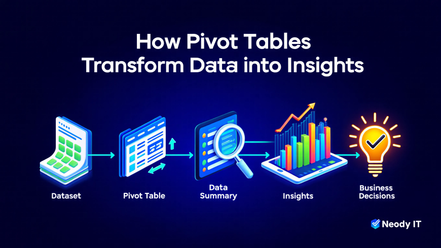
Pivot Tables transform complex datasets into clear summaries that help businesses understand performance and trends.
Instead of manually analyzing large spreadsheets, analysts can generate meaningful insights with just a few clicks.
A typical analytics workflow using Pivot Tables looks like this:
Dataset → Pivot Table → Data Summary → Insights → Business Decisions
For beginners entering data analytics, mastering Pivot Tables is an essential step toward building strong analytical skills.
At Neody IT, we recommend practicing Pivot Tables using real datasets before progressing to advanced tools such as SQL, Python, or Power BI.
What's Your Reaction?
 Like
0
Like
0
 Dislike
0
Dislike
0
 Love
0
Love
0
 Funny
0
Funny
0
 Angry
0
Angry
0
 Sad
0
Sad
0
 Wow
0
Wow
0