


Data Visualization Basics for Data Analysis Guide
Learn data visualization basics with charts, dashboards, and best practices. Understand how to turn raw data into insights. Beginner friendly guide by Neody IT.
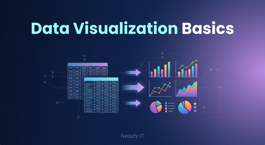
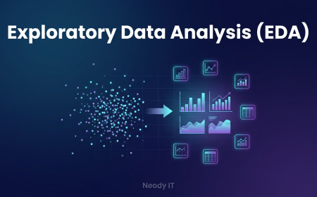
Data Visualization Basics: A Beginner Guide for Data Analysis
Introduction: Why Data Visualization Matters
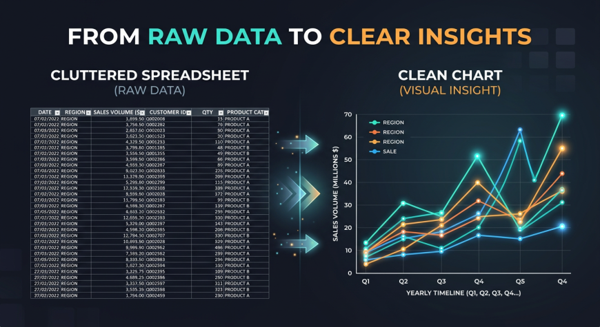
If you have ever looked at a spreadsheet filled with hundreds or thousands of rows, you already know how overwhelming raw data can feel. Numbers alone rarely tell a clear story. They require effort, time, and experience to interpret.
This is exactly where data visualization becomes powerful.
Humans are naturally wired to understand visuals faster than text or numbers. A simple chart can instantly reveal patterns, trends, and insights that would otherwise take hours to discover manually. Instead of reading endless rows of data, a well designed graph can highlight what truly matters.
At Neody IT, we always emphasize one key idea for beginners. Data is only valuable when it is understandable. Visualization bridges the gap between raw data and meaningful insights.
For example, imagine analyzing 1000 sales records. It is difficult to understand trends just by scanning numbers. But a line chart showing monthly sales growth can instantly reveal whether the business is growing or declining.
This is why learning data visualization is an essential skill for anyone entering data analytics.
What is Data Visualization
Simple Definition
Data visualization is the process of representing data using visual formats such as charts, graphs, and dashboards. Instead of presenting raw numbers, it transforms data into visuals that are easier to interpret.
Why It Is Important
Data visualization plays a crucial role in data analysis because it simplifies complex information. It helps analysts and business teams understand data quickly without needing deep technical knowledge.
Some key benefits include:
-
Makes data easier to understand
-
Helps identify patterns and trends
-
Improves decision making
-
Communicates insights clearly
In real world scenarios, businesses use visualization to monitor performance, track growth, and make strategic decisions.
Examples include sales growth charts, website traffic graphs, and interactive business dashboards.
Why Humans Understand Visuals Faster
How the Brain Processes Visuals
The human brain processes visuals far more efficiently than raw numbers. Patterns, colors, and shapes are easier to recognize compared to reading large tables of data.
When you look at a chart, your brain immediately starts identifying trends such as growth, decline, or unusual spikes. This process happens almost instantly.
Comparison Example
Consider two scenarios:
In the first, you are given a table with monthly sales numbers. You have to manually scan each row to identify trends.
In the second, you are shown a line chart representing the same data. Within seconds, you can clearly see whether sales are increasing or decreasing.
This is the power of visualization. It reduces the effort required to understand data and allows faster decision making.
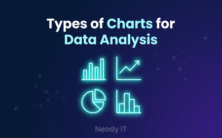
Types of Charts Every Beginner Should Know
Choosing the right chart is one of the most important skills in data visualization.
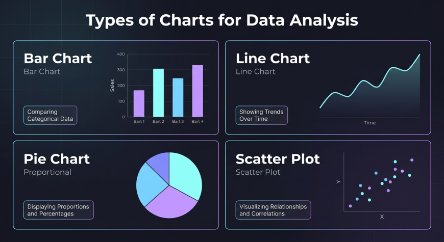
Bar Chart
Bar charts are used to compare different categories.
For example, a company can use a bar chart to compare sales across different products. Each bar represents a category, making it easy to see which product performs best.
Line Chart
Line charts are used to show trends over time.
They are ideal for tracking metrics such as monthly revenue, website traffic, or user growth. A line chart helps you understand whether a metric is increasing, decreasing, or remaining stable.
Pie Chart
Pie charts are used to show proportions.
They help visualize how different parts contribute to a whole. For example, a company can use a pie chart to display market share or revenue distribution across products.
Scatter Plot
Scatter plots are used to show relationships between two variables.
For example, a business might analyze the relationship between product price and sales. This helps identify patterns such as whether higher prices affect demand.
How Charts Reveal Trends and Insights
Data visualization is not just about creating charts. It is about discovering insights.
Identifying Patterns
Charts help identify patterns such as growth trends, seasonal changes, and long term performance.
For example, a line chart may reveal that sales increase during festive seasons every year.
Spotting Outliers
Visualization makes it easier to detect unusual data points.
For instance, a sudden spike or drop in sales can immediately be noticed in a chart. This allows businesses to investigate the cause and take action.
Business Example
Imagine a company tracking daily sales. Suddenly, there is a sharp drop in revenue.
In a spreadsheet, this might go unnoticed. But in a chart, the drop is clearly visible. This helps the business quickly identify and fix the problem.
Real World Examples of Data Visualization
Business Dashboards
Companies use dashboards to monitor key metrics such as revenue, profit, and sales performance.
These dashboards combine multiple charts to provide a complete overview of business performance.
Marketing Analytics
Marketing teams use visualization to track campaign performance.
They analyze metrics such as website traffic, conversion rates, and user engagement using charts and graphs.
Product Analytics
Product teams use data visualization to understand user behavior.
They analyze how users interact with features, which helps improve product design and user experience.
Data Visualization Best Practices
This is one of the most important sections for beginners.
Keep It Simple
Avoid clutter and unnecessary elements. Focus only on the most important information.
A simple chart is always more effective than a complex one.
Choose the Right Chart
Different charts serve different purposes.
Use bar charts for comparison, line charts for trends, and pie charts for proportions.
Choosing the wrong chart can make data confusing instead of helpful.
Use Clear Labels
Every chart should include clear titles, axis labels, and legends.
Without proper labeling, even a good chart can become difficult to understand.
Use Colors Wisely
Colors should highlight important data, not distract from it.
Avoid using too many colors, as it can make the chart look messy.
Focus on Storytelling
A good visualization tells a story.
Every chart should answer a specific question or provide a clear insight. Always think about what message you want to communicate.
Common Mistakes Beginners Make
Many beginners make simple mistakes that reduce the effectiveness of their visualizations.
Common issues include:
-
Using the wrong chart type
-
Adding too much data in one chart
-
Poor labeling
-
Using misleading scales
To fix these issues, focus on clarity and simplicity. Always design charts with the audience in mind.
Example Dashboard Explanation
A simple data dashboard typically includes multiple visual elements.
For example, a sales dashboard might include:
-
A bar chart showing sales by product
-
A line chart showing monthly revenue trends
-
A summary section displaying total revenue
-
Customer insights such as average purchase value
Dashboards combine multiple visuals to give a complete picture of performance. They are widely used in business environments to support decision making.
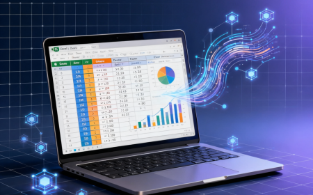
Tools for Data Visualization
There are several tools beginners can use to create visualizations.
Excel
Excel is one of the most beginner friendly tools. It allows users to create basic charts and perform simple analysis.
Power BI
Power BI is a powerful tool used for creating interactive dashboards. It is widely used in business analytics.
Tableau
Tableau is another popular visualization tool known for its advanced features and user friendly interface.
At Neody IT, we recommend starting with Excel and gradually moving to tools like Power BI or Tableau as your skills improve.
Practice Ideas for Beginners
The best way to learn data visualization is through practice.
You can start with simple tasks such as:
-
Creating a bar chart for sales data
-
Building a line chart for monthly trends
-
Designing a basic dashboard
Practicing with real datasets helps you understand how visualization works in real scenarios.
Why Data Visualization is Important for Data Analysts
Data visualization is not just a technical skill. It is a communication skill.
Data analysts are responsible for presenting insights to business teams. These teams may not have technical knowledge, so charts and visuals become the primary way to communicate findings.
A good analyst does not just analyze data. They tell a story using data.
Visualization helps bridge the gap between technical analysis and business understanding.
Final Takeaway
Data visualization transforms raw data into clear, actionable insights.
Instead of analyzing numbers manually, you can use charts and dashboards to understand patterns and trends instantly.
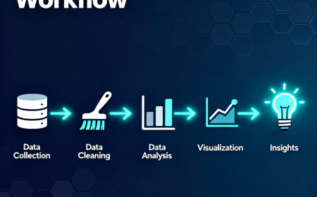
A simple workflow looks like this:
Data → Visualization → Insights → Decisions
For beginners learning through Neody IT, mastering data visualization is a crucial step in becoming a skilled data analyst.
Charts are not just visual elements. They are powerful tools that help businesses make better decisions.
What's Your Reaction?
 Like
0
Like
0
 Dislike
0
Dislike
0
 Love
0
Love
0
 Funny
0
Funny
0
 Angry
0
Angry
0
 Sad
0
Sad
0
 Wow
0
Wow
0